This story starts with a layoff.
Overnight, a railway-technology company dissolved most of its operational-engineering team — two of three engineers gone, and the last one about to leave for a month. Roughly 120 hours a week of work landed on my team: real engineering — querying the databases behind the product, calling legacy backend services, fixing data quality — almost none of it documented. Nobody could even say what all the recurring work was, let alone which of it was worth automating.
And the layoff had a second edge. The team that absorbed the work now had to prove it was worth keeping. Customers were waiting on this operational work, and the Head of Engineering was weighing a hard question — is this team's automation bet actually paying off, or is it the next thing to cut? Whether we could show the hours we were saving wasn't an academic exercise. It was, in a real sense, about our own jobs.
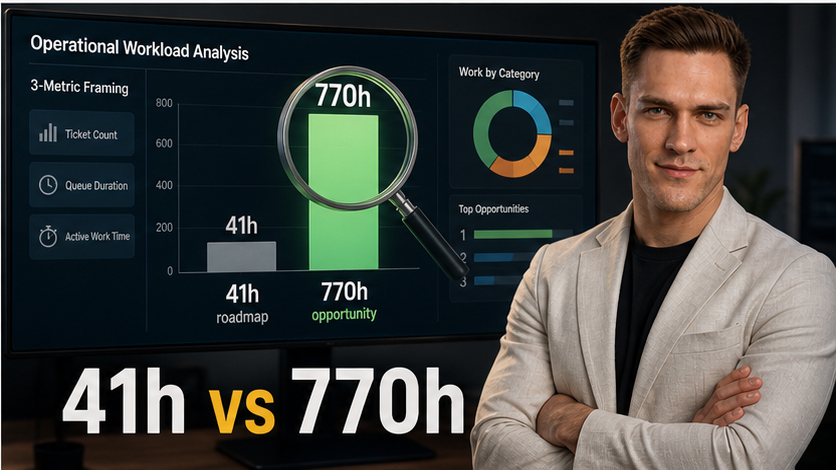
A month later my manager was presenting my analysis in the company All-Hands — a highlight slot he hadn't asked for once in six months — showing that the automation roadmap leadership had already agreed on was chasing 41 hours of work while 770 comparable hours, close to 19× the addressable time, sat ignored right beside it. Within days, the Chief of Staff, the Head of Engineering, and the Head of Operations were reaching out directly. My two-day throwaway prototype became the company's standing system for ranking process-automation work and reporting it to leadership.
How does "shadow one overworked engineer and find some quick wins" turn into that? Not through a master plan — through an idea that got deprioritized, two offhand conversations, a prototype I built on my own time, one chart that flipped the roadmap, and then a messy fight over the numbers that nearly sank it. I'll tell it as it happened, then pull out the repeatable method, so you can find the same hidden leverage in your own company.
The assignment that didn't look like much
The clock was the real pressure. The one engineer who still understood the inherited work was about to leave for a month of vacation — and while he was gone, my lead and I were the ones who'd have to keep all of it running. My task was reasonable and vague: shadow him before he left, learn the work, and automate whatever I could to lighten the load. The obvious move was to sit beside him, watch a few tasks, and start scripting the most painful one.
I did some of that. But shadowing only shows you what the person happens to be doing while you watch. I had no idea how often each task ran, how long it truly took, or what I wasn't seeing at all. Automating whatever passed in front of me would mean optimizing a local maximum — and we had no spare capacity to spend on the wrong thing. I became convinced that before we invested a single sprint into automating any known task, we had to zoom out and find out where the hours actually went.
The problem I went looking for
I have a habit that turned out to matter here: I go around asking people what slows them down, and offering to help with AI tooling. Over a lunch break I asked the Chief of Staff the same thing — what's hard right now, what's eating your time? He was stuck trying to build a company-wide picture of operational efficiency and couldn't get past the same wall I'd hit: nobody knew who ran which processes, which team owned them, how often they happened, how long they took, or even which were done at a desk versus which required someone physically out in the field. He'd exported a flat list of ticket types from our service-management tool and run out of road.
Two people stuck at opposite ends of the same missing number — and, it turned out, sitting on a data source rich enough to answer it, if you pulled it the right way. That's where it clicked: stop watching, stop guessing, and measure where the hours go.
The idea that got deprioritized — and the conversation that made me build it anyway
I proposed it. And it lost the prioritization argument — for entirely defensible reasons. The pressure was to ship automation; spending a sprint measuring instead of building felt like a detour. "Let's automate the tasks we already know about first." Reasonable. It kept slipping down the list, and I kept pushing for it in planning.
What changed my mind about waiting wasn't a meeting. It was an offhand conversation with a senior engineer about developer productivity, in which I proudly showed him a little dashboard I'd built tracking my own velocity — in story points. He didn't congratulate me. He said story points measure how much complexity you solve, not how much value you deliver, and that real productivity is working on the problems actually worth solving. I pushed back: my manager assigns my tickets, I don't get to choose what I work on. His answer stuck with me — when he's convinced something is genuinely important for the company, he just does it, prioritization debate or not.
So I did. On the train home that evening, and again early the next morning before the workday started, I built the analysis on my own time.
The prototype I didn't ask permission for
By standup the next day I had a working prototype. Instead of asking "would it be OK if I looked into this," I said: I picked this up, I've got a prototype dashboard, give me a couple of hours and I'll show you. Then I showed it.
My lead's reaction was immediate — this changes everything, go deeper. That turned a side-project into sanctioned work, and over the next day and a half I hardened it into a more accurate version: I pulled the data through a richer path than that flat export — one that exposed every status change and reassignment, so I could reconstruct how long each kind of work really took — and ranked process types not by how often they appeared, and not by how annoying they felt, but by the total hours they consumed.
I put it on a single chart: frequency on one axis, cost on the other, each process a bubble sized by total hours. The agreed automation targets — the famously irritating, everyone-complains-about-it tasks — came out as small bubbles, about 41 hours across the quarter. The biggest bubbles, roughly 770 hours of them, were processes the roadmap never mentioned, because everyone had quietly assumed they were "too complex to automate." The plan got reversed: the agreed targets were dropped, and the team turned toward the big bubbles. For the first time, our scarce hours were aimed by data instead of by gut.
The All-Hands win
The first time it went up the chain, there was no conflict at all — just applause. My manager presented my dashboard at the company All-Hands as the quarter's highlight: a new way to see where the company's operational hours actually went, and the automation opportunity it had surfaced. Then he marketed the capability itself — if any team wants this kind of analysis, come to us; we can do it for any process, any team, company-wide. It was pure success, and it put my name in front of leadership as the person who had built it.
Then the leaders started reaching out.
The quarter where the bill came due
The trouble showed up a quarter later, and it wasn't technical. It was political.
After the All-Hands I'd started collaborating on the KPIs — but only with the Chief of Staff. What I'd missed is that the Head of Engineering and the Head of Operations had their own firm ideas about what these numbers should be, and I had never brought them into the design. At the next quarterly review, all of that surfaced at once. They each reached out to me directly, and each wanted a different definition of what "operational efficiency" even meant:
- The Head of Engineering wanted "how much capacity have we freed?" — a hiring question.
- My lead wanted "are we getting faster?" — the age of open tickets and the cycle time of closed ones.
- The Chief of Staff wanted "are we optimizing the right processes?" — leverage, not just speed.
- The Head of Operations wanted a guarantee the metric wouldn't count work that wasn't ours, or distort how the team looked.
Four senior stakeholders, four valid agendas, none of them the same — and I was the junction box. I'd been hired as a junior data engineer: the person who picks up small, well-scoped tickets to support the seniors. Now I was the one holding four C-level agendas in my head and brokering between them.
It put me in a genuinely uncomfortable position. My lead would say "adjust it to show this." I'd answer, "but the Head of Engineering specifically needs that." I'd go to the Head of Engineering, who'd ask why I couldn't just build his version — while I was already thinking about the Head of Operations' constraint. Each stakeholder saw only their own view; I had to hold all four. To each of them, I was the one introducing friction, and the easy path was obvious: just do what my manager says and stop arguing. There was no incentive to do otherwise — except that it was right. So I took the harder road and told each of them, honestly: your perspective is valid, and here's why the company also needs these other parts to keep the others whole.
Then I made the conflict legible. I sat down with every stakeholder, collected their competing requirements, and systematized them into a single table — one row per perspective, what each wanted and why. That table turned four arguments into one shared picture, and from it we cut concrete follow-up stories that I started implementing.
The moment I almost killed the project
Meanwhile everyone assumed the work was trivial — "one more chart, one more query, an hour or two." It never was. Working with data at this scale is a grind of latency: every job waits for compute to spin up, every change crawls through dev, staging, and production, a one-line fix means a pull request, fifteen minutes of tests, and a wait for review. And underneath it, the numbers were lying. We'd aimed for company-wide KPIs from the start, so thousands of tickets across dozens of categories poured into the same charts. One month's median age would jump tenfold while resolution time collapsed to near zero — and tracing each impossible value meant hunting down who had changed what, by hand. Fix one, two more surfaced: a bottomless pit.
Then the deepest low, and it wasn't technical. I'd promised the dashboard by the next All-Hands, with every head waiting on it — above all the Head of Engineering, who wanted the before-and-after: how many manual hours the automation had actually saved. A spontaneous cleanup meeting with the last Technical-Delivery engineer pulled the floor out. I'd assumed the old team had all done manual work, so that "before" was a clean baseline. It wasn't — the team had always been split, some building small automations while others worked the manual tickets. There was no clean "before." The comparison I'd promised wasn't apples to apples; it wasn't even the same fruit. For a moment I thought the whole project was unsalvageable, and I was ready to walk away.
The reframe, and the breakthrough
What pulled me back was, of all things, my lead's narrower agenda. He didn't care about the unanswerable company-wide before-and-after. He wanted something concrete: are we getting faster? — cycle time, broken down per ticket category. (He wanted the per-category view; the chiefs wanted it aggregated.) Narrowing the question made it tractable again.
And that narrowing pointed straight at the breakthrough. The reason everything had felt like a bottomless pit was that I was trying to compute clean KPIs for every process at once. So I stopped boiling the ocean and took one ticket category at a time:
- Pick a single process — ideally one we already understood well.
- Plot how its metrics evolved over time, on its own.
- Let the data-quality problems for that one process surface — then actually run them to ground and fix them. (This is where building a classification layer earned its keep: tagging each ticket by process and owning team so one category could be isolated cleanly, with bulk-migration noise fenced out before any KPI is computed.)
- Only once that one process was genuinely clean and understood, share it — first with my lead, then, after that quality check held, with the wider stakeholders.
- Then extend: add the next process, and the next, one at a time.
A bottomless sea of thousands of tickets became a finite list I could work down, process by process. Make one unit fully correct before scaling — the very principle that should have governed the automation work in the first place.
Where it stands now
I'd love to end with the clean triumph — every stakeholder delighted, every saved hour tallied and displayed. That isn't where the story is yet. I haven't walked the Head of Engineering and Head of Operations through the final results; that part is still in progress.
What I can say is that the despair has turned into a working paradigm. The cleaned cycle-time and ticket-age KPIs already feed a leadership dashboard. The one-process-at-a-time method gave the project a spine it never had, and a clear picture is emerging of what the right architecture, the right dashboard, and the right rollout actually look like. My two-day prototype became a standing pipeline, and the people who hold the budgets now come to me to ask where the hours are.
The everyone's-happy ending hasn't arrived. But the method that gets us there has — and that method is the part worth teaching, which is what the rest of this article is about.
The discovery was the easy, dramatic part. Making it survive contact with four stakeholders and dirty data is what turned a chart into a system. Everything below is the method underneath it — why the roadmap was wrong in the first place, what to measure, and how to run the same analysis yourself.
Why almost every automation roadmap is wrong
Most companies run on tickets. IT service management, customer support, internal operations — work arrives as a ticket, gets assigned to a team, moves through statuses, and eventually closes. Whatever your tool is called, the shape is the same: a queue of work, with a paper trail.
When leadership decides what to automate, they almost never read that paper trail. They ask the people closest to the work, "what's painful?" — and people answer honestly. The problem is that the honest answer is shaped by four biases, and every one of them points away from the real money.
1. Annoyance is not cost. The process our leadership had agreed to automate was genuinely irritating — repetitive, low-skill, the "a human shouldn't be doing this" kind. I measured it: about ten minutes, every other day. Real annoyance, real consensus, almost no hours behind it. (Frequency, by contrast, is a fine signal — something done twenty times a day is a great candidate. The trap isn't picking something frequent; it's picking something that felt bad.)
2. The expensive work was never even considered — because nobody knew it could be automated. This is the big one, and it's why the 770 hours stayed invisible. The people closest to those processes — and the operations leadership above them — assumed the work simply wasn't automatable: "that needs human judgment, it's too complex." So it was never proposed at all. Seeing through that takes more than being a software engineer; it takes hands-on awareness of what just became possible — agentic AI that does today what genuinely required a person eighteen months ago. Only once we started working those "impossible" tickets did it become obvious how much of them automates cleanly.
3. "Automatable" is not all-or-nothing. The complex work looked un-automatable because people pictured automating the whole task. But a process is many small steps, and most automate trivially — the expensive part is usually glue: ten browser tabs to gather data from ten systems, download-move-run-rename. One dashboard that unifies the ten sources, or a script that collapses the shuffle, removes hours of context-switching without "automating the job." It raises the worker's level of abstraction — from shuffling files to thinking only about the decision — and that's invisible to anyone scoring a task as automatable-or-not.
4. The people who hold the knowledge may not want to give it up. The operators you're trying to measure are also wondering whether they're automating themselves out of a job. That fear is rational, and it quietly suppresses the information you need. The initiative has to be framed honestly — tools to take the drudgery off your plate, not we're replacing you — or the people with the tribal knowledge won't surface the opportunities.
So the roadmap optimizes the loudest pain, ignores the most expensive work on the false belief that it can't be touched, scores complex tasks as all-or-nothing, and runs into quiet resistance from the people who know the most. On my team, the agreed targets were real annoyances that simply weren't where the hours were — while hundreds of hours sat in processes everyone had written off as "too human to automate."
The fix is not better intuition. It's measurement — to rank by real cost — paired with enough frontier awareness to recognize that the expensive work is recoverable.
The two numbers that turn tickets into money
Before measuring anything, you have to decide what you're measuring for. A ticket is just a row in a database until you connect it to something the business cares about. There are two connections, and they're the ones every executive already understands:
1. Cost — the capacity it consumes. Every ticket eats employee hours. Hours are salary; salary is money. If a category of work consumes 300 hours a quarter, automating it doesn't just "save time" — it hands the equivalent of weeks of an engineer's capacity back to the company. This is the number that answers do we need to hire?
2. Cycle time — how long the requester waits. Every ticket has a clock running from creation to resolution. On the customer side, that clock is satisfaction. There may be formal SLAs and SLOs; even where there aren't, a customer who waits three weeks for something they expected in three days is a customer thinking about churn. Internally, the same clock is a colleague blocked from doing their own job. Cycle time bends upsell, retention, and renewal — which is to say, it bends revenue.
You can measure other things — error rates, subjective satisfaction scores, rework. But cost and cycle time are the two that are (a) almost always already in your ticketing data and (b) immediately legible to the people who control budgets. Start there.
Everything that follows is just a disciplined way of ranking your processes by these two numbers, and then proving how much of each you can give back.
The method: identify the opportunity, then qualify it
Here is the part worth copying. It's a loop: five steps take you from "a pile of tickets" to "here's exactly which change to build and what it's worth," and a sixth closes the loop after the build, proving what the change actually saved. The building itself sits in the middle — and it's the part everyone already knows how to do.
At a glance, before we go deep on each part:
- Measure — rank every process by the total hours it costs, not by how loud it is. (Step 1)
- Visualize — put frequency, cost, and total hours on one chart so the priorities are undeniable. (the bubble chart)
- Select — let the data set the shortlist; let judgment pick from it. (Step 2)
- Understand the work as it is — watch the process, break it into steps, find the waste. (Step 3)
- Design the work as it should be — turn each removed inefficiency into a concrete change. (Step 4)
- Quantify before building — estimate the hours each change buys back, and rank by return. (Step 5)
- Quantify after building — once it ships, prove how much it actually saved. (Step 6)
The conspicuous gap between steps 6 and 7 is writing the automation itself. That's the well-understood part. The whole point of everything wrapped around it is to make sure that hard engineering effort lands only on the few changes that move the number — and then to prove, afterward, that it did.
Step 1 — Exploratory data analysis: rank by total cost, not by count
First you need categories. Every ticket has to fall into some repeatable type of process, because you optimize types, not individual tickets. If your tickets are already categorized, use that. If they aren't, group them yourself — regex on titles, or an LLM to cluster free-text descriptions into a handful of process families. Rough categories beat no categories.
Then, for each category, compute three orthogonal metrics. Not one. Three:
| Metric | What it tells you | What it hides | |---|---|---| | Ticket count | How much noise the category generates | Says nothing about effort per ticket | | Queue / assignment duration | How long tickets sit with your team — the requester's wait | Includes idle time nobody worked | | Active work time (status = In Progress) | The closest proxy for actual effort spent | The metric most likely to be under-logged |
Each is meaningless alone. High count + low time = a volume problem, cheap per instance. Low count + high time = rare but brutal. And the gap between queue duration and active work time is itself a signal — a large gap means the process pauses and resumes repeatedly, waiting on something. Those stop-start processes are often the most automatable, because the waiting is the waste.
The ranking metric is total hours over the period — sum the effort across all tickets in a category. That sum is directly proportional to the value of automating it. Sort descending. The top of that list is your candidate set.
Even if your time data is noisy — "active work time" is only a rough proxy when people don't update statuses — the ranking usually holds: a category eating 300 hours doesn't trade places with one eating 14 because of imperfect logging.
The one visual that reframes the whole conversation
Numbers in a table don't move a leadership team. One chart does.
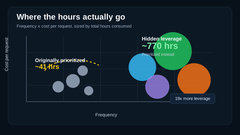
Each bubble is a category of operational work — placed by how often it happens (x) and time per request (y), and sized by the total hours it consumes. The small grey cluster was the agreed roadmap (~41 hrs); the large highlighted bubbles are where the hours actually were (~770 hrs). Anonymized illustration of the real dashboard.
Put frequency on one axis and cost per ticket (cycle time, or active hours) on the other. Draw each process category as a bubble, and size the bubble by total hours consumed. Now the entire operation is on a single map:
- Bubbles in the top-right — frequent and slow — are your screaming priorities.
- A small bubble that everyone feels is a loud annoyance that costs little.
- A large bubble sitting quietly in a corner is the expensive process nobody talks about.
Overlay the existing roadmap on this map and the mismatch is undeniable — as it was for us, where the agreed targets were the small bubbles and the biggest ones had never been discussed. You don't argue with a chart like that; it argues for you.
Step 2 — Selection: data narrows, judgment chooses
The chart gives you candidates; it doesn't make the decision. Combine the ranking with what you know — which processes are about to grow, which are seasonal, which are politically sensitive, which are genuinely automatable versus inherently human. Pick the few worth a deeper look. Data sets the shortlist; judgment picks from it.
Step 3 — Knowledge transfer (the "as-is"): watch the work, break it into steps
Sit with the person who does the work and break it into steps. At each one, find the waste: the manual copy-paste, the wait for approval, the lookup in a system that should've been integrated. This is also where you do the causal reasoning the data can't — why does this category spike in winter? The data raises the questions; the operator answers them, which is what justifies projecting the pattern forward instead of blindly extrapolating.
Step 4 — Story (the "to-be"): design the better workflow
Define the improved future process, step by step, and turn the difference between as-is and to-be into concrete work items. Each removed inefficiency becomes a candidate story. Keep them small and specific — "auto-fill the request form from the system that already holds the data" — not "fix the process."
Step 5 — Qualify the result: put a number on it before you build anything
This is the step that earns trust, and it's the one most people skip. Before writing a line of automation, estimate what the change is worth:
Expected time saved = frequency × P(inefficiency) × Δ time cost- frequency — how often the process runs (from Step 1).
- P(inefficiency) — the share of runs that actually hit the waste you're removing.
- Δ time cost — how much time the fix removes per affected run.
Multiply it out and you have an honest, defensible estimate of the hours this specific change buys back — expressed in the cost currency leadership already cares about. Do this for each candidate story and you can rank the whole backlog by return before committing a single sprint:
ROI = Expected time saved / Implementation costImplementation cost is just your normal estimate (story points, days). Sort by ROI, and the highest-leverage work floats to the top on its own. Then — and only then — you build, starting from the top. The building is the part that needs no new framework.
Quantifying before building isn't bureaucracy — the estimate is what lets leadership reallocate with confidence. An automation you can't measure is one nobody will fund twice.
Step 6 — Quantify the realized impact: prove it after you build
Step 5 was an estimate, made before building. Once the automation ships, you close the loop by measuring what actually changed — the part that proves the team's value, and, in my story, the exact number the Head of Engineering was waiting for. There's no single "impact number"; there are complementary views, and which one you reach for depends on the question being asked:
- Before-and-after. The same metric for a process, measured before the automation and after. Powerful when there's a clean baseline — and treacherous when there isn't. (This is the trap that nearly killed my project: if the "before" was never what you assumed, the comparison lies.)
- Stacked line chart, summed hours. Total hours per month, stacked by process, so one chart shows both the overall operational load and how it breaks down by component. Best for "is the whole thing shrinking?" The cost: stacking makes individual trends harder to read. It also buys trust: a lone aggregate invites the question "how do I know that number is right?", but when the viewer can see it's built from these specific processes, a contaminated component shows up as a visible bump instead of hiding inside the total.
- Individual line charts, median per ticket. Each process plotted separately, month over month, using the median time per ticket. Best for "is this specific process getting cheaper per run?"
Why the sum in one case and the median in the other? It comes down to which lever you actually control:
- When you can't control how many tickets arrive — demand is exogenous — the only thing you can improve is how long each one takes. Track and optimize the median per ticket.
- When you can influence the volume — you can eliminate or reduce the number of requests, not just speed each one up — the sum (count × time) is the honest measure, because it captures both levers at once.
No single plot tells the whole story; the more perspectives you hold side by side, the truer the picture. And the final step is deliberately not automated: a human — and it usually has to be a human, because so much company and process context is required — reads these numbers together with everything they know, and decides. The decision stays imperfect; you're still acting under incomplete information. But informed-but-imperfect beats blind, and that improvement is the entire point.
Why the leaders reached out — and why this is really a positioning move
When the analysis landed, the priority list got rewritten — my lead deprioritized the agreed targets and pointed the team at the big bubbles. That alone would have been a good quarter. But the more durable effect was positional. As the messy quarter that followed showed, each leader wanted a different number out of the same data — capacity freed, cycle time, leverage, scope — and I turned out to be the one person holding both the technical detail and the business framing at once. Producing the analysis made me that someone: the role expanded from "build the dashboard" to "coordinate the leaders on what we should even be measuring," and the direct outreach followed.
That's the part worth underlining if you're doing this to grow your own standing: the analysis is the artifact, but the positioning is the payoff. The person who can quantify where the company's hours go becomes the person leadership consults about where they should go next.
How to spot the same pattern in your company
You can run this next week. The ingredients are almost certainly already sitting in your ticketing system:
- Pull the event history, not the snapshot. Get status transitions and assignment durations from the API. The durations are the whole point.
- Group tickets into process types. Use existing categories, or cluster them with regex or an LLM. Rough is fine.
- Rank categories by total hours, using three metrics together — count, queue duration, active work time — and watch the gap between the last two for stop-start waste.
- Plot the bubble chart — frequency × cost, sized by total hours — and overlay whatever roadmap already exists. Let the small bubbles and the big quiet ones make your case.
- Pick a few, watch the work, design the to-be, and quantify the saving with
frequency × P(inefficiency) × Δ time costbefore building. Rank by ROI. Then build, top-down.
Most teams are one disciplined afternoon of analysis away from discovering that their roadmap is aimed at the 41 and not the 770. The data to prove it already exists. Almost nobody looks.
That gap — between the work that feels expensive and the work that is expensive — is the opportunity. Go measure it.
Appendix — the architecture, for the builders
Everything above is the strategy: what to measure, in what order, and why it changes the decision. This last section is the tactics — how to actually build it, first as a throwaway MVP and then as a production pipeline. Skip it if you only wanted the method; read on if you want to build it.
The mistake here is starting big. Build the throwaway version first, prove the metric is worth anything, and only then invest in a pipeline. There are two stages, and most teams skip straight to the second.
Start with the MVP: a CSV and a vibe-coded app
The fastest possible proof of concept needs no data platform at all:
- Export a CSV from your ticketing tool — ideally one that includes each ticket's status history, but even a basic export is enough to start.
- Vibe-code an app on top of it. Point an agentic coding tool (Codex, Claude Code) at the CSV and have it hack together a small Python data app with a plotting library like Plotly — the categories, the rankings, the bubble chart. Hours, not weeks. It's the quickest way to put something real in front of a stakeholder.
- Validate the metric with that prototype before building anything durable. Most of the value of a first version is learning what to measure — which is exactly what you don't want to discover after you've built a production pipeline around the wrong definition.
My own first dashboard was a two-day hack of roughly this shape. Only once it had proven its worth did it earn the pipeline below.
Then productionize: API → lake → medallion → BI
Once the definition stops moving and the analysis has to run every month, give it a real spine. None of it is exotic; that's the point.
| Layer | What it does | Technology | |---|---|---| | Source | System of record for the work — every ticket, status transition, reassignment | The ITSM / ticketing tool (in my case FreshService), via its REST API | | Raw / Bronze | Land the API responses untouched — audit trail and reprocessing safety net | Databricks on a cloud data lake, governed by Unity Catalog | | Cleaned / Silver | Type and de-duplicate events; classify each ticket into a process category and tag the owning team | SQL transforms (subject-pattern matching) as Delta tables | | Aggregated / Gold | Business-level KPIs per category and month — count, median ticket age, median cycle time | SQL aggregations orchestrated in Python (Databricks SDK), run on a SQL warehouse | | Delivery | The charts leadership actually reads, refreshed automatically | Looker Studio, connected directly to the Databricks gold tables |
The whole spine is API → lake → layered (medallion) transforms → BI dashboard, parameterized by environment so the exact same code runs against a dev catalog before it ever touches production. But the layers aren't there for tidiness, and "I built a medallion architecture" explains nothing. They're there to solve one specific problem: trust — which is the thing that actually decides whether a dashboard gets used or quietly ignored.
Here's the failure mode they prevent. The naive version is a single query that both selects the data and renders the chart. It works — until a value looks implausible and you think, that can't be right. Now you want to see the rows behind it, and you can't: that query never saved them anywhere. Re-deriving the selection by hand every time is too much effort, so you never do — and a number you can't inspect is a number you stop believing. Materialized layers fix exactly this. The silver and gold tables are the data the charts read, sitting somewhere you can query directly, so when something looks wrong you go look at the rows instead of distrusting the whole board. That inspectability is what lets you find contamination rather than just fear it. You will always have data-quality issues; the layers are what make them findable.
Two more choices that follow the same problem-first logic:
- Pull events, not snapshots. Problem: a flat list of current ticket states can't tell you how long anything took — the durations live in the transitions. Fix: hit the richer API path that exposes status transitions and assignment durations. My first real breakthrough was nothing cleverer than that; everything downstream depended on it.
- Classification is its own layer for a reason. Problem: tickets arrive as raw subjects, and an aggregate computed over the wrong set silently includes work that isn't yours or noise that isn't real. Fix: a dedicated step that tags every ticket by process category and owning team, so you control exactly what each KPI is aggregating over — because aggregating without knowing what you're aggregating over is how contamination hides in plain sight.
- Let the delivery layer earn its simplicity. Problem: over-engineering the pipe before the metric is agreed wastes the effort if the definition moves. Fix: the first production version shipped as a manually-refreshed Google Sheet the executive Looker Studio dashboard read — zero infrastructure, fast validation. Only once the definitions stopped moving did the end state drop the spreadsheet and expose the Databricks gold tables to Looker Studio directly.
For the one-off forensic questions — "was this day an outlier?", "which tickets got bulk-moved in that migration?" — natural-language AI-assisted SQL over the warehouse and an LLM over the raw event logs answered in minutes what would otherwise be an afternoon of hand-written queries. The deterministic pipeline is the source of truth; the AI agents are how you explore it.
The data-quality reality nobody warns you about
One hard-won lesson, because it's the difference between a KPI people trust and one they quietly stop believing: operational data is contaminated by operational events. The bulk group-migrations from my story — admin cleanups that re-touched years-old tickets and made one month's metrics swing wildly — aren't a freak occurrence; any compliance cleanup, reorg, or tooling change will do the same. Publish the raw numbers and you'll spend more credibility explaining the anomaly than you gained from the dashboard. The classification/scope layer is exactly where you fence those artifacts out — which is why it's a first-class layer and not a footnote.